If you're searching for how to build a KPI dashboard, you've probably already built one that nobody uses. A beautiful grid of charts and numbers that gets reviewed enthusiastically for two weeks, then slowly fades into digital wallpaper — technically accessible, practically invisible.
The problem isn't the tool. It's the design philosophy. Most dashboards are built to display data. Useful dashboards are built to trigger decisions.
This guide breaks down the difference — and gives you a framework for a dashboard that actually earns its place in the weekly routine.
Three patterns kill dashboards with remarkable consistency:
The instinct is understandable: "If we're building a dashboard, let's put everything on it." Revenue, margin, pipeline, churn, headcount, NPS, website traffic, social followers, email open rates, task completion, project status, burn rate...
The result is a wall of numbers. Nobody can process 30 metrics at a glance. So nobody glances. The dashboard becomes an archive, not an instrument.
The rule: A KPI dashboard should have 8–15 metrics. If you can't scan it in under 60 seconds and know the health of the business, it has too many items.
A revenue number means nothing alone. €85,000. Is that good? Bad? Better than last month? On target? Above or below the trend?
Dashboards that show raw numbers without comparison are decoration. They answer "what is the number?" but not "should I be worried?"
What each metric needs:
With these five elements, a single metric tells a complete story: "Revenue is €85K, target is €100K, down 5% MoM, at risk." Now you know what to discuss.
The most common failure: the dashboard exists but nobody is responsible for it. Nobody ensures the data is current. Nobody schedules a time to review it. Nobody acts on what it shows.
A dashboard without a review cadence is a dashboard that will be outdated within a month.
The fix: Every KPI has an owner. The dashboard has a scheduled review. The review has a clear output: decisions and actions.
Don't ask "what metrics should we track?" Ask "what questions does leadership need to answer every week/month?"
For most companies, these questions fall into 5 categories:
1. Revenue health: Are we making enough money? Is the trajectory right?
2. Sales performance: Is the pipeline healthy? Are we closing effectively?
3. Customer health: Are we keeping the customers we have?
4. Delivery performance: Are we executing reliably?
5. Financial discipline: Are we spending within plan?
Not every company needs all five categories. A pre-revenue startup doesn't need revenue health metrics yet. A services firm without subscriptions doesn't need churn tracking. Pick the categories that match your current operational reality, not your aspirations.
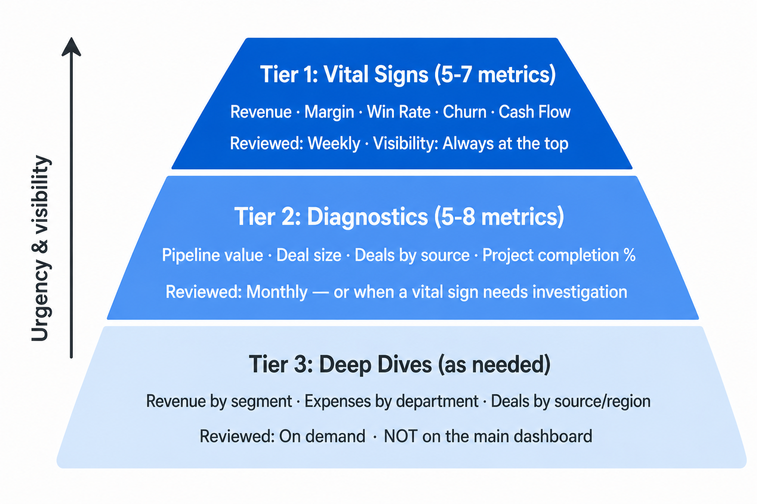
Not all metrics deserve equal visibility. Organize your dashboard into three tiers:
Tier 1: The vital signs (5–7 metrics)
These are the numbers that, if they're healthy, mean the business is fundamentally okay. Revenue, margin, win rate, churn, cash flow. These go at the top of the dashboard. They're reviewed weekly.
Tier 2: The diagnostic metrics (5–8 metrics)
These explain the vital signs. If revenue drops, is it because pipeline value dropped (fewer deals), win rate dropped (losing more), or deal size dropped (winning smaller)? Diagnostic metrics help you find the root cause. These are reviewed monthly or when a vital sign needs investigation.
Tier 3: The deep dives (as needed)
These are the detailed breakdowns: revenue by category, deals by source, projects by team, expenses by department. You don't need these on the main dashboard. They live in separate views, accessed when a specific question arises.
The mistake is putting Tier 3 metrics on the main dashboard. That's how you get a wall of 30 numbers nobody reads.
A number alone is data. A number with context is information. A number with context and a decision framework is actionable.
Here's how to make each KPI actionable:
Step 1: Define the direction.
Is higher better (revenue, win rate) or is lower better (churn, cost per acquisition)? This seems trivial, but it determines how health is calculated.
Step 2: Set targets.
Every KPI needs a target — not an aspirational stretch goal, but a realistic expectation for the current period. Targets can come from:
Step 3: Define health thresholds.
For "lower is better" metrics (churn, costs), invert the logic: green when at or below target, red when 20%+ above target.
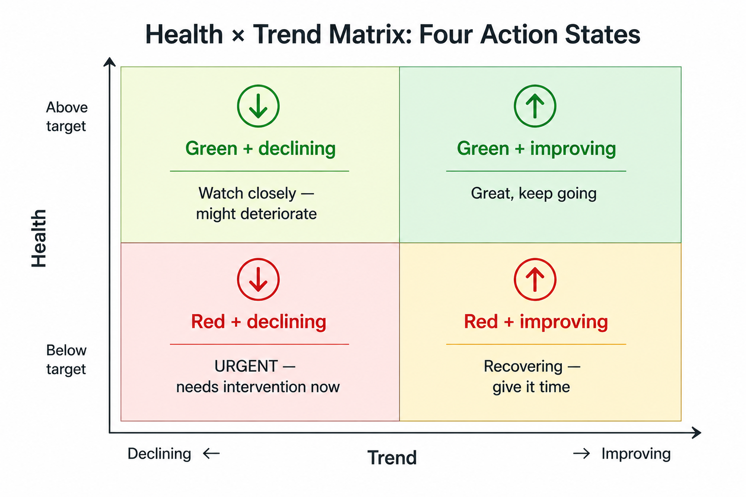
Step 4: Add trend comparison.
Is this metric improving or declining compared to the previous period? A metric can be green (above target) but trending down — which is an early warning. Or red (below target) but trending up — which suggests the improvement actions are working.
The combination of health + trend gives you four states:
A dashboard without a review is a poster. Here's the cadence that works:
Every Monday (or Friday, depending on your rhythm):
This takes 10 minutes. No deep analysis. Just a pulse check that ensures nothing is silently deteriorating.
Once a month, go deeper:
Every quarter:
Vanity metrics. Website visits, social media followers, email list size — unless these directly drive revenue decisions, they don't belong on a business KPI dashboard. Put them in a marketing-specific view.
Lagging-only dashboards. If every metric is backward-looking (last month's revenue, last quarter's churn), you're driving by looking in the rearview mirror. Include at least 2–3 leading indicators: pipeline value, deals in late stages, upcoming project deadlines.
Manual data entry. If someone has to manually type numbers into the dashboard every week, it will be outdated by week 3. The best dashboards pull from operational data automatically — or at minimum, have a clear process for who updates what and when.
No owner per metric. Every KPI should have one person who knows why it moved and what to do about it. "The team tracks revenue" means nobody tracks revenue. "Sarah owns revenue reporting" means someone will notice when it dips.
The ultimate test of a KPI dashboard isn't whether it looks good. It's whether it changes behavior.
Ask yourself:
A dashboard that drives one good decision per week is worth more than a dashboard that displays 50 metrics nobody reads.
If you want a KPI dashboard that's structurally connected to your strategy, projects, and daily operations — explore how UniFrame builds metrics into the operating system, not on top of it.

.jpg)
.jpg)